I have applied the post-processing workflow detailed in the tutorial I wrote to the photographs from my ‘Ghost House’ and ‘Disciplinary Institutions’ series.
Most pictures required little adjustments because I took care to expose them correctly. I discovered that my favourite tools to do slight exposure adjustments were either manually adjusting the curve, or doing selective Brightness and Contrast Correction via Image > Adjustments > Shadows/Highlights.
I did some saturation adjustments to some pictures, either on the whole picture or sometimes for a specific colour channel to bring out a specific detail from the composition. For example, for ‘Cellar Door 1’, I brought the saturation up +16 for Yellow and +18 for green. The effect is more over the top than what I usually go for but because this picture is retro-kitsch on purpose, it’s an appropriate choice.
Before:

After:

I also straightened the geometry of the corridor shots from the asylums when my tripod was crooked due to uneven floors.
Before:


After:

I used light denoising on all pictures. I also use smart sharpening on most pictures, but not on any picture featuring reflections in mirrors, dew on a window or a diffuse, fuzzy light, because sharpening destroyed any of these interesting effects.
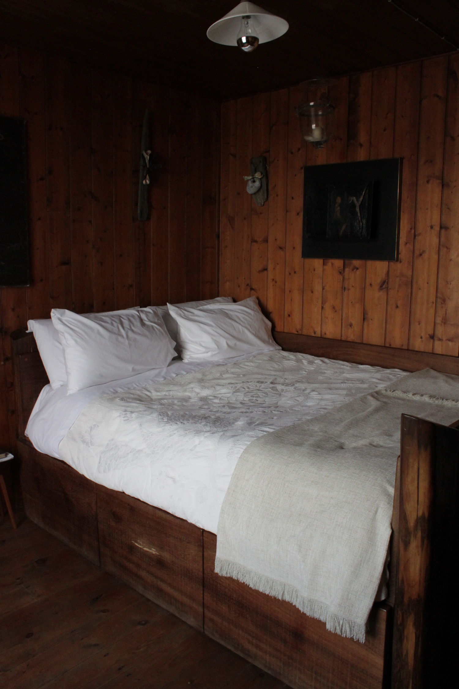
I will now detail the workflow I used on the 3 photographs that required the heaviest processing. On most other photographs I processed, while the processing improves print quality, the adjustments are too slight to be noticeable in web quality.
Ghost House III.1
Before:

I redid the whole picure after realising that the ‘Dust and scratches’ filter blurred the image rather than really denoise it though it turned out not to make a huge difference on that photograph.
-Lens Correction.
-Selective Brightness and Contrast Correction Image > Adjustments > Shadows/Highlights. Corrected blown highlights: Amount 60%, Tonal Width 30%, Radius 30px. Midtones contrast +15%.
-Saturation +10.
-Reduce Noise, Despeckle.
-Smart sharpen Amount 50% Radius 5 pixels.
After:

Ghost House III.11
Before:

-Lens Correction.
-Selective Brightness and Contrast Correction Image > Adjustments > Shadows/Highlights. Corrected too dark shadows: Amount 15%, Tonal Width 30%, Radius 30px. Corrected blown highlights: Amount 19%, Tonal Width 30%, Radius 30px. Midtones Contrast +19%.
-Saturation +20.
-Reduce Noise, Despeckle.
-Smart sharpen Amount 50% Radius 5 pixels.
After:

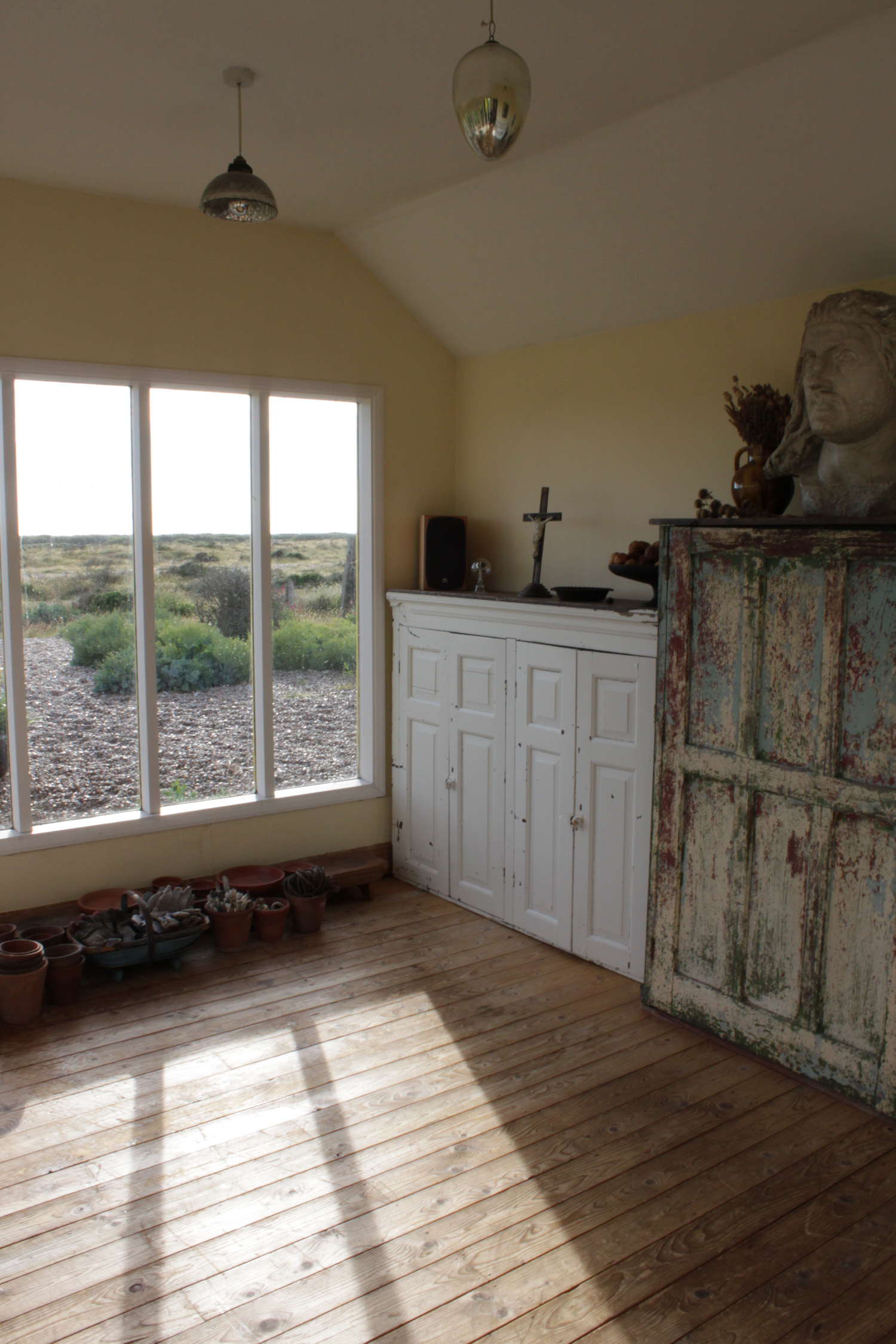
Woodlawn
Before:

-Lens correction.
-Levels: burn highlights on purpose, they’re just the window.
-Selective Brightness and Contrast Correction Image > Adjustments > Shadows/Highlights. Burn highlights some more: Amount 100% tonal Width 16%.
Manual Curves.
-Saturation -49 (slightly tinted monochrome)
-Reduce Noise.
-Smart sharpen Amount 50% Radius 5 pixels.
After:

Repeat similar process with similar picture differently exposed for trial.
Before:

-Lens correction.
-Selective Brightness and Contrast Correction Image > Adjustments > Shadows/Highlights. Burn highlights: Amount 100% tonal Width 50%. Lighten shadows: Amount 29% Tonal Width 30%
Manual Curves.
-Saturation -27 (slightly tinted monochrome)
-Reduce Noise.
-Smart sharpen Amount 50% Radius 5 pixels.
The result is similar but there is less glare on the wall. I suspect this is due to the original picture, not the processing. I chose this version for printing.
After: